


Have you ever marvelled at how designers and artists effortlessly weave eye-catching and harmonious color combinations into their work? The key to their enchanting artistry lies within the captivating realm of Achieving Color Harmony for Effective Design, and at its core, lies a remarkably simple yet potent tool: the color wheel.
In this comprehensive guide, we’re going to demystify the world of color theory and the color wheel, making it accessible to everyone, whether you’re an aspiring artist, a budding designer, or just someone with a curiosity for the colorful world around you.
No need for complicated jargon or a deep background in art; we’ll break it down into bite-sized pieces and help you understand how colors work, how to mix them effectively, and even how to use them to convey emotions and messages. By the end of this journey, you’ll have a newfound appreciation for the way color shapes our world, and you’ll be ready to apply this knowledge in your own creative endeavors. So, let’s dive in and explore the fascinating realm of color theory and the color wheel.
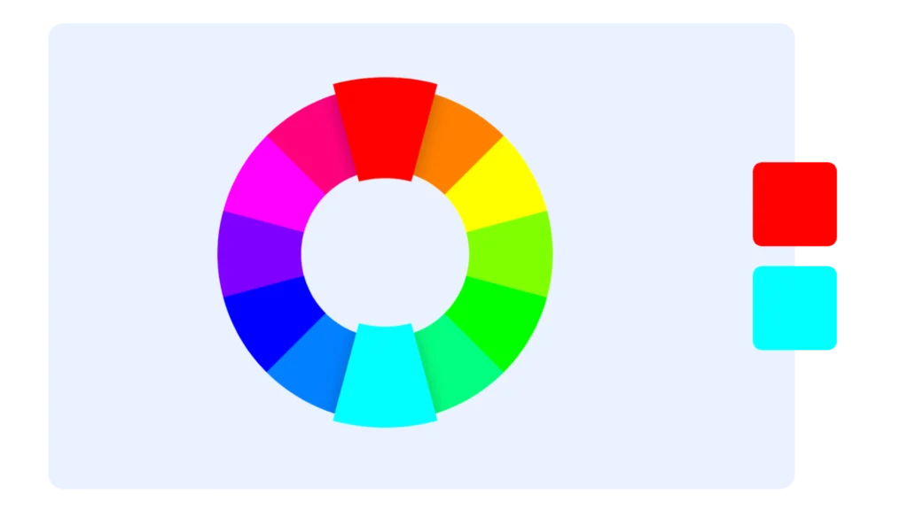
Complementary
When two colors are positioned on opposite sides of the color wheel, they create a high contrast and high impact color combination. This combination makes the colors appear brighter and more prominent when used together.
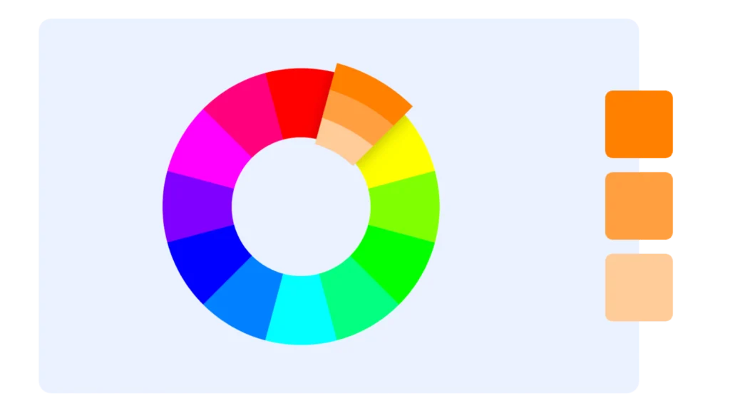
Monochromatic
This color combination consists of three variations of a single base color, offering a subtle and conservative blend. It is a versatile combination that can be effortlessly incorporated into design projects, resulting in a harmonious appearance.
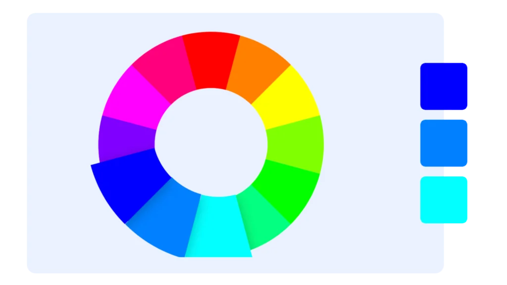
Analogous
Analogous color schemes consist of three adjacent colors on the color wheel. While this combination offers versatility, it can also be overpowering. To create harmony, designate one color as the main focus and utilize the remaining colors as complementary accents.
Triadic
Three colors that are evenly separated on the color wheel create a high contrast color scheme, although it is not as strong as the complementary color combination, making it more versatile. This combination results in bold and vibrant color palettes.

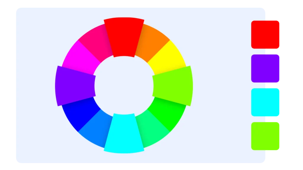
Tetradic
Tetradic color schemes consist of four colors that are evenly spaced on the color wheel. These schemes are bold and work best when one color is dominant, while the others are used as accents. Balancing becomes more challenging as the number of colors in your palette increases.
Understanding Color Combinations
A. What Are Color Harmonies?
Color harmonies act as the enchanting seasoning in a recipe, transforming your creative dish into a delightful masterpiece. In the world of colors, they are like the ingredients that harmoniously blend together to create a visual symphony. You might be pondering, ‘How do designers and artists effortlessly select colors that harmonize to evoke that perfect look or mood?’ Well, the answer lies in the realm of achieving color harmony for effective design, and that’s where we’ll begin our colorful journey.
B. The Color Wheel: Your Color Mixing Buddy
Imagine having a trusty sidekick that helps you decide which colors should hang out together. That’s exactly what the color wheel is in the world of color theory. It’s like a roadmap that shows you the way around the colorful universe. And the best part? You don’t need to be a color expert to use it effectively.
Here’s the scoop: Isaac Newton, way back in 1666, was the clever mind behind the color wheel. He mapped out the rainbow of colors onto a circle. You might be wondering, why a circle? Well, it’s because it shows how colors are related, kind of like a family tree for colors.
Now, let’s see what this color wheel can do for us. We’ll explore different types of color combinations that you can create using this nifty tool, and before you know it, you’ll be a color harmony expert.
So, are you ready to start your colorful journey? Let’s take a closer look at those harmonious color combinations next.
Primary, Secondary, and Tertiary Colors
Now that we’ve got the hang of color harmonies and the color wheel, let’s chat about the colors themselves.
Primary Colors: Think of these as the superheroes of the color world. They’re the colors that can’t be mixed from other colors. In the world of colors, we have three primary colors: red, yellow, and blue. These three are like the building blocks for all the other colors you see.
Secondary Colors: These are the colors that happen when you mix two primary colors together. It’s like a fun science experiment. In our color universe, we have three secondary colors: orange (red + yellow), green (yellow + blue), and purple (blue + red).
Tertiary Colors: Okay, now we’re getting a bit fancy. Tertiary colors are made by mixing a primary color with a secondary color. We have six of these in our rainbow of colors. Some of them have unique names like orange-red, yellow-orange, and blue-green.
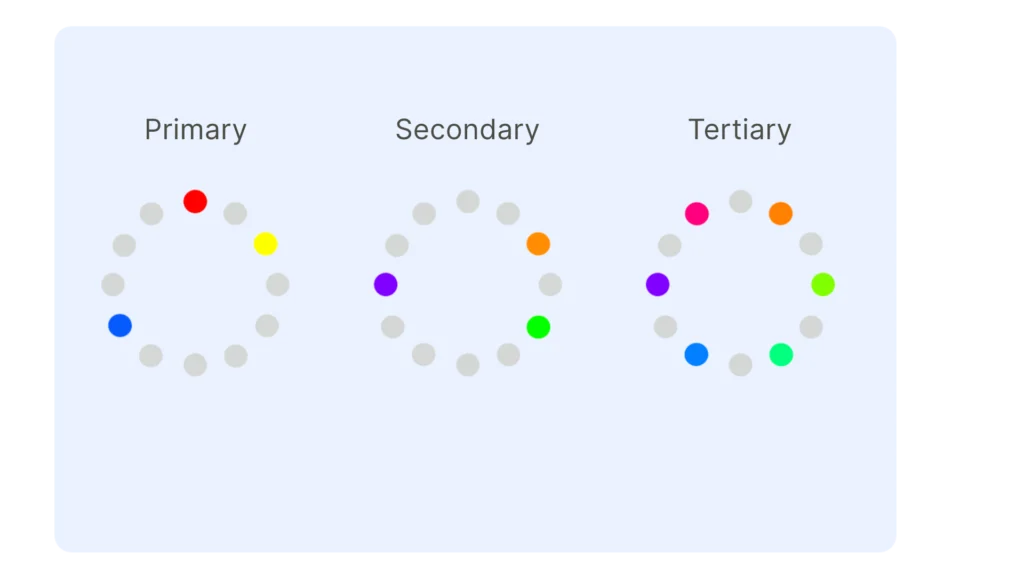
Getting a grasp of primary, secondary, and tertiary colors is akin to mastering the ABCs of color blending. It’s your stepping stone to crafting vibrant and captivating works of art. As we embark on our colorful voyage, we’re not only going to unravel the mysteries of mixing primary colors but also unveil the captivating world of shades and tones. So, are you excited to plunge deeper into the enchanting realm of colors? Let’s journey on!
Warm and Cool Colors
Now that we’re becoming color connoisseurs, it’s time to explore something fascinating: the warmth and coolness of colors.
Warm Colors: Think of these as the cozy, inviting colors. They’re the ones that remind you of sunshine, warmth, and comfort. Imagine the warm hug of the sun on a bright summer day. Warm colors include shades of red, orange, and yellow. They bring a sense of energy and excitement to your creations.
Cool Colors: On the flip side, we have the cool colors. These are the tranquil and soothing colors that bring to mind calm waters and cool breezes. Blue, green, and purple are the cool colors. They’re like a breath of fresh air, evoking serenity and relaxation.
Understanding the difference between warm and cool colors is like knowing when to wear a cozy sweater or relax in a cool, shady spot on a hot day. These color temperature vibes can play a big role in how people feel when they see your designs. So, as we continue our colorful journey, keep these warm and cool color secrets in your creative toolbox. We’re not done yet – there’s more to explore!

Creating Shades, Tints, and Tones
Imagine you have a set of magical tools that can transform colors and add extra flair to your artwork. Well, you’re in luck because in this section, we’re going to unlock the secrets of creating shades, tints, and tones.
Shades: These are like the shadowy cousins of colors. When you add a bit of black to a color, you create a shade. It’s like dimming the lights in a room; the color becomes deeper and richer. Shades can add drama and depth to your designs, but be careful not to overdo it – they can be pretty intense!
Tints: On the flip side, tints are like a breath of fresh air for colors. Add some white to a color, and you get a tint. This lightens things up and makes the color less intense. Tints can be your best friend when you want to balance out vivid color combinations and create a more mellow vibe.
Tones: Tones are like the middle ground between shades and tints. When you mix a color with both black and white (or gray), you get a tone. It’s like the Goldilocks of colors – not too dark, not too light. Tones reveal subtleties in the color that might not be apparent in the original shade.
By mastering the art of shades, tints, and tones, you’ll have the power to fine-tune your color palette like a pro. It’s all about finding that perfect balance for your design, and we’re here to help you do just that. So, are you ready to add some magic to your colors? Keep reading to explore even more colorful tricks and techniques!

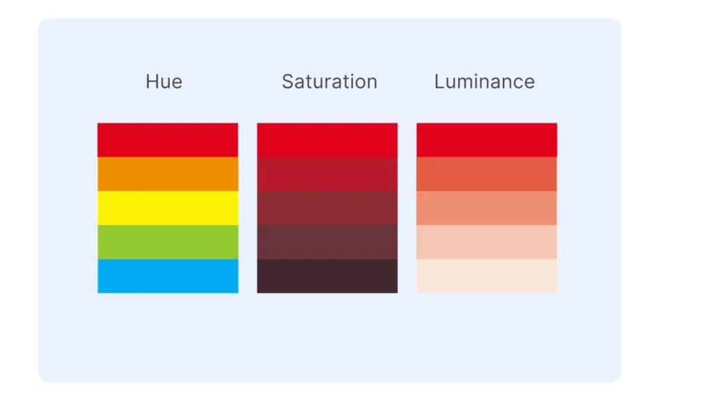
Hue, Saturation, and Luminance
Alright, color enthusiast, you’ve learned about primary, secondary, and tertiary colors, and you’ve mastered the art of shades, tints, and tones. Now, it’s time to dive deeper into the world of colors and explore what makes each shade unique.
Hue: Think of hue as the personality of a color. It’s the specific name of a color, like “red” or “blue.” For instance, there are different hues of blue, from navy blue to sky blue, and each one has its own character. Understanding hue helps you choose the right shade for the mood you want to convey.
Saturation: Saturation is all about intensity. Imagine your favorite color turned up to full volume – that’s high saturation. But if you dial it down a bit, the color becomes softer. Saturation is like a dimmer switch for color. It’s what makes a color pop or blend in, and it’s a handy tool for creating different vibes in your work.
Luminance: Luminance is the brightness or lightness of a color. Picture it as a scale from super bright to almost black. Luminance plays a crucial role in how colors interact with light and each other. It can make colors look vivid or subtle, depending on where they fall on the luminance scale.
So, why does this matter? Understanding hue, saturation, and luminance gives you the power to fine-tune your color choices for that perfect design. You can create just the right mood and draw attention to what matters most in your artwork. As we move forward, we’ll continue to unravel more color secrets, making you a true color maestro. Ready for the journey? Let’s keep exploring!
Color Meanings and Symbolism
Colors are more than just pretty shades on a canvas or a webpage. They have personalities and meanings that can affect how people feel and what they think. Let’s dive into the captivating world of color meanings and symbolism.
Cultural and Psychological Meanings: Colors can mean different things to different people and cultures. For instance, red might symbolize love and passion in one culture, while it could signify luck in another. In the realm of psychology, colors can evoke specific emotions. Think of how a vibrant yellow makes you feel happy, or how a calm blue can bring a sense of tranquility.
Color Choices in Design: When you’re creating something, whether it’s a logo, a website, or a painting, your choice of colors matters. It’s like choosing the right words to tell a story. Colors can convey a message, evoke a feeling, or even persuade someone. We’ll explore how you can use the language of colors to your advantage in your designs.
Understanding the meaning and symbolism of colors is like knowing the secret code of the visual world. It lets you speak to people through your artwork, sending messages and feelings without words. So, let’s unravel these colorful stories and find out how to use them to your creative advantage. Ready to continue our colorful journey? Keep reading!
Conclusion: Your Colorful Journey Continues
Congratulations, color explorer! You’ve traveled through the fascinating realm of color theory, the magic of color combinations, and the mysteries of hues, shades, tints, and tones. You’ve delved into the warmth of some colors and the coolness of others, and you’ve even mastered the secrets of color psychology and meaning.
As you conclude this colorful journey, remember that the world of colors is vast and ever-evolving. It’s like an endless adventure where there’s always something new to discover and create. Whether you’re an artist, a designer, or simply someone who appreciates the beauty of colors, you now have the tools and knowledge to bring your visions to life.
Don’t be afraid to experiment, to mix and match, and to explore the endless possibilities that colors offer. The more you play with colors, the more you’ll uncover their hidden depths and the unique ways they can inspire, captivate, and communicate.
Read this post to also understand shape psichology in design!
So, keep your creative spirit alive, and let colors be your partners on this colorful journey. And if you ever find yourself in need of more inspiration, guidance, or colorful companions, remember that the world of color is at your fingertips, waiting for you to paint your own vibrant story.
Thank you for joining us on this adventure. May your creative path always be as bright as the colors you choose. Happy coloring!
Achieving Color Harmony for Effective Design
CreateStudio | ClipMagic | PhotoVibrance | Plasfy | MediaPlace | Twinkle
